SC/NATS 1870 – Assignment 1: Comparative Mixing
Hello, dear friend, you can consult us at any time if you have any questions, add WeChat: daixieit
SC/NATS 1870 – Assignment 1: Comparative Mixing
Due: Feb 5, 2:30pm | Worth: 15%
LATE ASSIGNMENTS NOT ACCEPTED
Goals:
• Perform various types of mixing processes, using various media, and compare your results from different exercises
• Describe your results for each exercise
• Answer questions about the exercises and demonstrate your understanding of the material
Materials:
• Acrylic Paints: Red, Yellow, Green, Blue, Black, White. Optional: Magenta & Cyan
o Sources: Michaels, Staples, Aboveground Art store, Dollar store, Amazon also fine
o **Only a small amount of paint is needed
o Note the brand and specific colours used in your assignment
o You may share paints with a friend, but you must do your own exercises, and hand in your own work (otherwise it will be considered plagiarism)
o Other colourants (pencil crayons, crayons etc.) may also be possible to use if cost is an issue. Speak with the professor.
• Heavy paper (printer paper would be too light)
o Paint your ‘swatches’ (areas of colour) on the heavy paper, cut them out, then tape or glue them into TEMPLATE file.
• Palette for mixing paints – can use foil or plastic plate (white)
Hand in:
• TEMPLATE file – or exercises done in a similar format/layout as the TEMPLATE file.
• Hand in assignment in-class, in an envelope, or securely stapled together. Loose papers not accepted. All material is handed in together at the sametime.
• Make sure your name and student number are clearly written on the front. Underline your last name
• Maximum size: 12x18 inches
You are expected to complete the exercises and write-ups on your own. Note that copying from another student, using the same painting swatches, or otherwise duplicating results is considered plagiarism and is punishable.
Note: If you have limited colour vision – please speak with professor and/or make a note on your assignment.
References:
1. https://colourliteracy.org/comparative-mixing-explained
2. Good site on mixing processes:http://www.animations.physics.unsw.edu.au/jw/light/colour-mixing.htm
3. David Briggs’s hue value chroma site – excellent information on all types of colour mixing – e.g. http://www.huevaluechroma.com/051.php for subtractive mixing and
http://www.huevaluechroma.com/045.php for sample spectral reflectance curves
PART 1. Subtractive Mixing Process: Paints
In this section, you will mix paints, and sketch the reflectance curve for each component colour, as well as the mixed colour. You will then answer questions based on the subtractive mixing process.
Note that a colour 'swatch' is a painted colour sample (could be straight from the paint tube, or a mixed sample). You will mix coloured swatches and arrange them as indicated in the instructions. You can then cut them out, and tape/glue them into the TEMPLATE file.
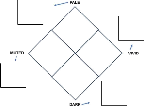
Q1.1: Mixing pale, dark and muted variations of hues (characters)
Choose 1 hue. Mix a pale (adding white), dark (adding black) and muted (adding grey) variation for each hue. Arrange the swatches as follows, and sketch a spectral reflectance curve for each
Q1.2 Mixing intermediate hues (hue circle)
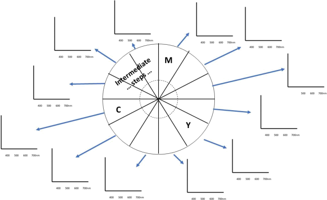
Choose 3 traditional ‘primary’ hues – i.e. RYB or CMY (either is fine). Create a 12-step hue circle, mixing equal visual steps (as best as you can) between the hues. On the same sheet of paper, sketch reflectance curves for each hue.
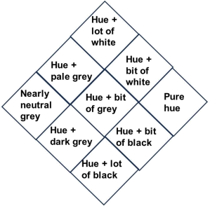
Q1.3 Mixing a hue family (or hue plane)
Choose a different hue from Q1.1. Create a hue family (or hue plane), with at least a 3x3 grid/diamond. An example is shown below. You can make more swatches if you like. A potential layout is shown below.
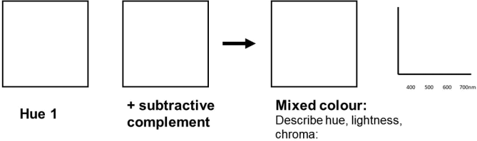
Q1.4 Mixing subtractive complements
Choose 2 hues opposite from each other on your hue circle (e.g. M and G) - i.e. subtractive complements. Mix them, and sketch a reflectance curve.
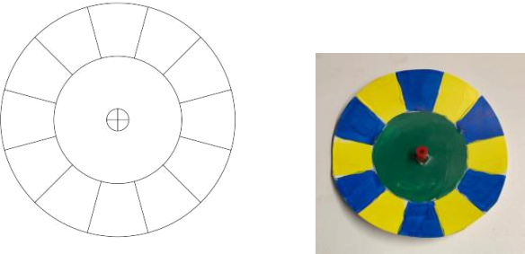
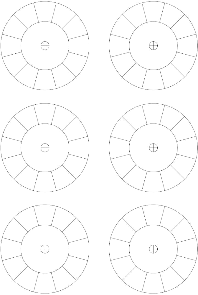
Part 2. Optical Mixing Process: Spinning Disks (Temporal Mixing)
In this section you will explore a type of additive mixing called temporal optical mixing, which results due to the persistence of vision. You will perform your investigation using spinning disks.
Experimental Procedure:
Choose the same pair of complements that you did for Q1.4 (e.g. M and G). Using the template below, create a spinning disk for optical mixture as follows:
Mix your two (i.e. magenta and green) paints together subtractively (on your palette) and paint the central circle of the disk with that colour. On the outer pie-shaped areas on the circle, paint alternating areas of each hue separately. An example for yellow and blue is shown below. When the paint is dry, cut out your disk and spin it rapidly.
Example: (more templates at end of file)
Q2.1 Method: The method of quickly spinning the disk is up to you (some options: use a fan from the dollar store, a CD player, see link oneClass for using a string, maybe able to find disks at dollar store or Amazon, drill, put a screw in the lid of ajar). You need to have a way to spin the disk fast enough to see a single blended colour - if you do not see a single colour, try another spin method (likely disk is not spinning fast enough). Describe the mechanism used to spin the disk. What colours do you see in the inner and outer portions of the disk? Are they the same?
Repeat the exercise, using 1) red and green; 2) red, blue and green; 3) any other combination of 2 or more hues of your choice. (Note - this is a very cool effect - you are free to explore as much as you like - try cyan, magenta and yellow; you can use other media like pencil crayons, coloured paper; or prepare the coloured outer portions of the disk on the computer and make a print out. Bonus marks will be given.)
Q2.2 Observations: Record your exercise results in your Observing Log:
Observing Log: (example)
|
Colours in Disk |
Subtractively mixed colour |
Optically mixed colour |
Comparison of Hue, Lightness & Chroma of subtractive vs. optical mix |
|
… |
|
|
|
|
R, G |
|
|
|
|
R,G, B |
|
|
|
|
Choice 1 |
|
|
|
|
Any other choices |
|
|
|
**You will also hand in your disk templates with your assignment
Q2.3 Discuss your results: Comment on whether you achieved the colours you were expecting. Are the subtractively mixed and optically mixed colours the same? If they are different, how are they different? Do you see any achromatic mixes?
PART 3. Additive Mixing Process: Lights on a Computer Screen
In this section you will be mixing colours additively using a simple interactive on your computer screen or phone:
https://www.physicsclassroom.com/Physics-Interactives/Light-and-Color/RGB-Color-Addition/RGB-Color- Addition-Interactive
(Note - if the interactive does not work on your computer or phone (a Java script) - see if another student can help. Or if you can find a similar app/program, you can use that inspead.)
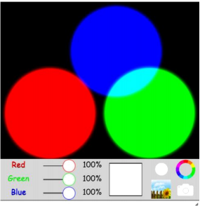
Choose the same pair of complements that you did for Q1.4 (e.g. M and G). Using the above interactive, overlap magenta and green areas, to create an additive mixture. Depending on your colour choice, you may need to first generate one of your hues by overlapping 2 circles and/or adjusting the intensity of one or more circles (i.e. using the % slider bar at the bottom).
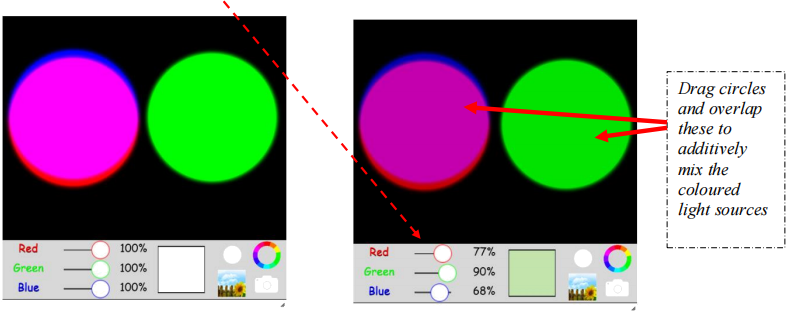
Q3.1
What is the mixed colour? Take a screen shot. How does the additively mixed colour compare in terms of its hue, lightness and chroma to i) the subtractively mixed colour of Q1.4 and ii) the optically mixed colour of Q2.2 (First row in Table)? If you decreased the intensity of any of the coloured light sources, what happens when the coloured light sources are mixed at full intensity?
Q3.2
Describe the full explanation of how the subtractive mixing process works, and why you see the subtractively mixed colour in Q1.4.
Q3.3
Describe the full explanation of how the temporal optical mixing process works, and why you see the optically mixed colour in Q2.2. Include a description of how and which cones are activated.
Q3.4
Describe the full explanation of how the (simple) additive mixing process works, and why you see the additively mixed colour in Q3.1. Include a description of how and which cones are activated, and how the activation is different from Q3.3.
Part 4: Bonus section - Afterimage
Choose one your colours from Q1.4, and paint one in the left circle in the template below, and the other in the right circle.
Q4.1
Generate the afterimage of the colour on the left, by staring at dot in the middle the painted circle on the left for 30 seconds, then looking at the dot in the white circle in the middle. How does the colour of the afterimage compare to the colour in the right circle (i.e. the subtractive complement). Describe any differences in terms of hue, lightness and chroma, as well as the perceived luminosity of the afterimage.
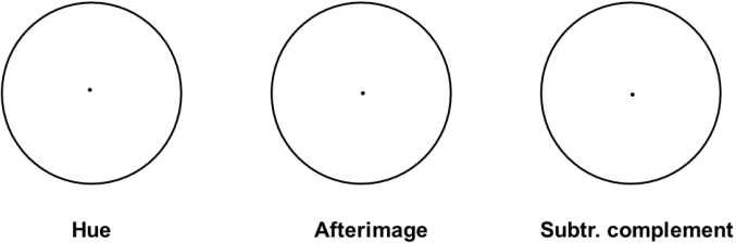
You can try to match the hue, lightness and chroma for the afterimage colour, and paint a swatch beside the subtractive complement. If the afterimage and subtractive complements are different, why do you think they are different? You could also try the exercise in reverse, starting with the other hue, or try other pairs of hues.
2024-02-07