The brand and name of the cereal product.
Hello, dear friend, you can consult us at any time if you have any questions, add WeChat: daixieit
Database: cereal.csv
Python Libs: matplotlib, numpy, pandas, or other necessary python libs
Attributes:
Name: The brand and name of the cereal product.
Mfr: Manufacturer of the cereal, typically abbreviated to one letter (e.g., K for Kellogg's).
Type: The type of cereal, which could be cold or hot cereals.
Calories: The number of calories in one serving of cereal.
Protein: The grams of protein per serving.
Fat: The grams of fat per serving.
Sodium: The milligrams of sodium per serving.
Fiber: The grams of dietary fiber per serving.
Carbo: The grams of complex carbohydrates per serving.
Sugars: The grams of sugar per serving.
Potass: The milligrams of potassium per serving.
Vitamins: The percentage of FDA recommended vitamins and minerals.
Shelf: The shelf placement in stores, which could potentially correlate with purchase frequency or consumer visibility.
Weight: The weight in ounces of one serving.
Cups: The number of cups in one serving, which may correlate with the perceived size of the serving.
Rating: A nutritional rating, which could be based on an aggregate of the nutritional content, potentially following an algorithm that considers the overall healthfulness of the cereal.
API for the ranking table visualization: python cereal.py -r
Output Example:
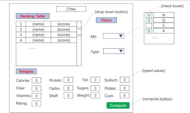
1. The “ Filters ” section has two components “ Mfr ” and “Type ” that are dropdown menus. It shows check boxes to allow filtering. Then, filter out the cereals whose values are not marked as “V ” (checked) in the check box.
2. The “Weights ” section has 13 components that correspond to the rest of the attributes. It allows users to type in numeric values as weights for each attribute.
3. Every time when the user clicks the “Compute ” button, it will first filter out cereals according to the check boxes from the “ Filter ” section, then, it will calculate the scores by using the weights from the “Weight ” section. The score is calculated as the following: score = attribute_1 * weight_1 + attribute_2 * weight_2 + attribute_3 * weight_3 + … … . Finally, once we have the scores, show the nutrition ranking of the cereals according to the descending order of the scores.
API for the heatmap visualization: python cereal.py -h
Create a heatmap visualization that is similar to the following example:
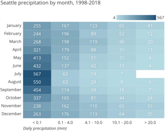
1. In our heatmap visualization, the left column should be the numeric attributes of the cereals given by our database.
2. Normalize our data values in a 0~1 scale (0 is the min value for each attribute, 1 is the max value for each attribute).
3. Then, create 5 range sections: 0-0.2, 0.2-0.4, 0.4-0.6, 0.6-0.8, 0.8-1.0.
4. Each cell represents the number of cereals that lies in each range for each attribute.
5. Create an appropriate title, and also, create a color bar as legend (just like the one in the example). “ Blue gradient ” / “ Blues ” is a preferred color mapping for this heatmap visualization.
2023-11-28